
Metroeyes
A complete UX and visual upgrade for Metroeyes, combining research, interface redesign, performance improvements, and a new brand direction to create a faster, clearer, and more premium shopping experience.
Duration
1 week
Industry
Eye Care
Client
Metroeyes Limited
Category
Website Development
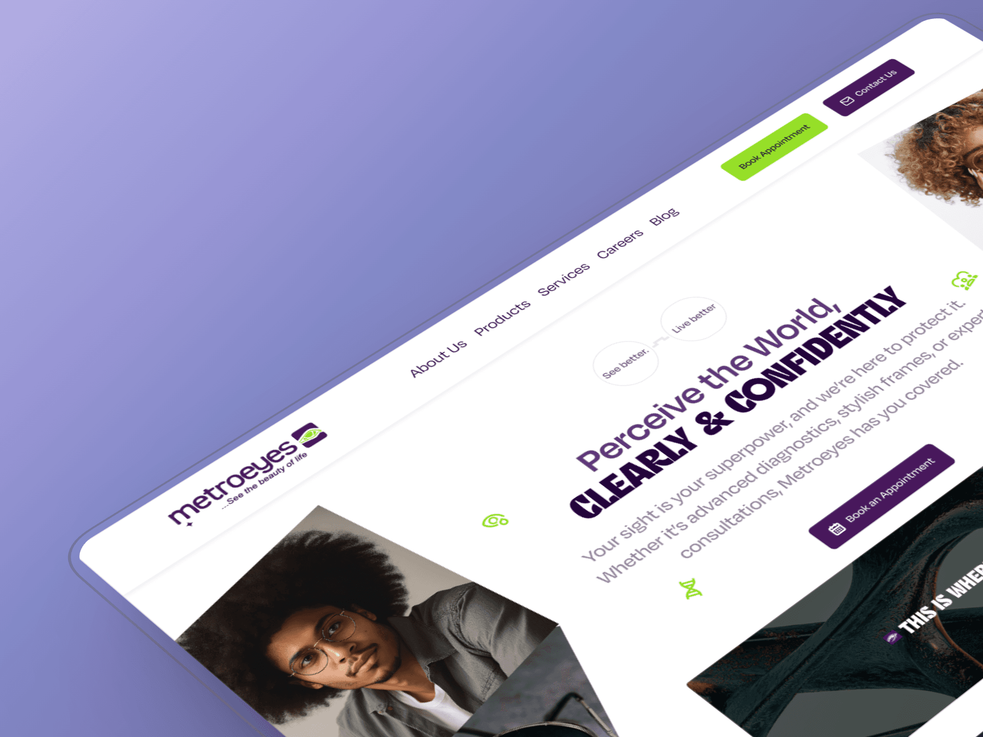
Rebuilding the experience from the ground up
Metroeyes needed more than a visual refresh. The existing experience had opportunities across navigation, product discovery, checkout, and mobile usability, so I started by understanding where users were experiencing friction rather than immediately redesigning the interface.
Starting with the users
I began with a UX audit and customer surveys to identify the problems behind the existing experience. This gave me a clearer picture of how people navigated the site, what information they needed when browsing products, and where the purchasing journey could become unnecessarily difficult.
From there, I reworked the core experience around three priorities:
Make products easier to discover.
Make the purchasing journey easier to understand.
Make the experience feel more polished without sacrificing speed.
Redesigning the journey
I redesigned the navigation and product filtering system to make browsing more intuitive, particularly on smaller screens. The checkout experience was also reworked to remove unnecessary friction and create a more straightforward path from product discovery to purchase.
Visually, I introduced a more premium direction through cleaner typography, refined colour accents, stronger hierarchy, and a more deliberate use of space.
The goal wasn't simply to make Metroeyes look better. Every visual decision was tied back to making the experience easier to navigate and more confident to use.


Making the experience feel faster
A polished interface loses its value when the experience feels slow. Performance therefore became part of the design process rather than something left entirely to development.
Designing motion with purpose
I introduced lightweight animations and interaction cues to make the interface feel more responsive without overwhelming the user or adding unnecessary complexity.
The animations were intentionally subtle. They helped communicate transitions, feedback, and changes in state while keeping the focus on the products and the task at hand.
Performance as part of UX
I also considered how the redesigned experience would perform across devices, particularly on mobile. Async loading was introduced to help pages load more efficiently and create smoother interactions.
This was an important part of the project because good UX isn't only about what an interface looks like. It is also about how quickly and effortlessly someone can use it.
Extending the redesign into a brand
The project eventually grew beyond the website itself. I developed a full rebrand proposal including a new wordmark, colour palette, and brand guidelines to give Metroeyes a more consistent visual identity.
This allowed the website redesign to become part of a broader brand direction rather than an isolated interface update.
The result
Metroeyes went from needing a website refresh to having a clearer digital experience and a stronger visual foundation for growth.
The project brought together research, UX, UI design, interaction design, performance thinking, and branding, giving me the opportunity to approach the product as a complete experience rather than just a collection of screens.
Free 20-min intro call
Tell us what you’re building
Work with a team that brings clarity, care, and creativity to every project.