
Swift Analytics Case Study: Real-Time Disease Tracking & Medical Data Integration
Swift Analytics is a disease tracking software designed to provide real-time feedback on disease outbreaks while integrating medical records from hospitals and other databases. The goal is to offer up-to-date health information and actionable insights, allowing users to stay informed and make better decisions during potential health crises.
Duration
2 weeks
Industry
Medical Fied
Client
Eze
Category
UI/UX Design

Problem Statement
The current healthcare systems struggle with providing timely and accurate information on disease outbreaks. Many rely on fragmented data sources, causing delays in critical health updates. Swift Analytics addresses this by delivering real-time alerts and a centralized platform for accessing medical records. This empowers users with immediate health threat notifications and advice based on comprehensive, updated data.
Research
To inform the design, I conducted user interviews with healthcare professionals and potential users. The research revealed two major pain points:
Lack of Timely Information: Users need instant updates on outbreaks to respond effectively.
Scattered Medical Data: Healthcare providers expressed frustration with fragmented data that hinders decision-making.
A competitor analysis showed that while some solutions offered outbreak alerts, none provided the seamless integration of medical data with real-time notifications.
Design Thinking & Process
Using the insights from research, I began ideating on ways to present both real-time outbreak notifications and medical records in a user-friendly format.
Wireframes: Initial low-fidelity wireframes focused on simplifying access to key features—outbreak alerts, medical records, and personalized health suggestions.
User Flows: I designed separate flows for users receiving outbreak alerts and for healthcare providers accessing medical records. These flows ensured easy navigation from one task to another without confusion.
Design Decisions
Several important design decisions shaped Swift Analytics:
Color Scheme: I used bold, contrasting colors like red for alerts and soft blues and greens for regular updates to make urgent notifications stand out while maintaining an overall calming aesthetic.
Typography: A clean, sans-serif font was selected for easy readability, even on small screens.
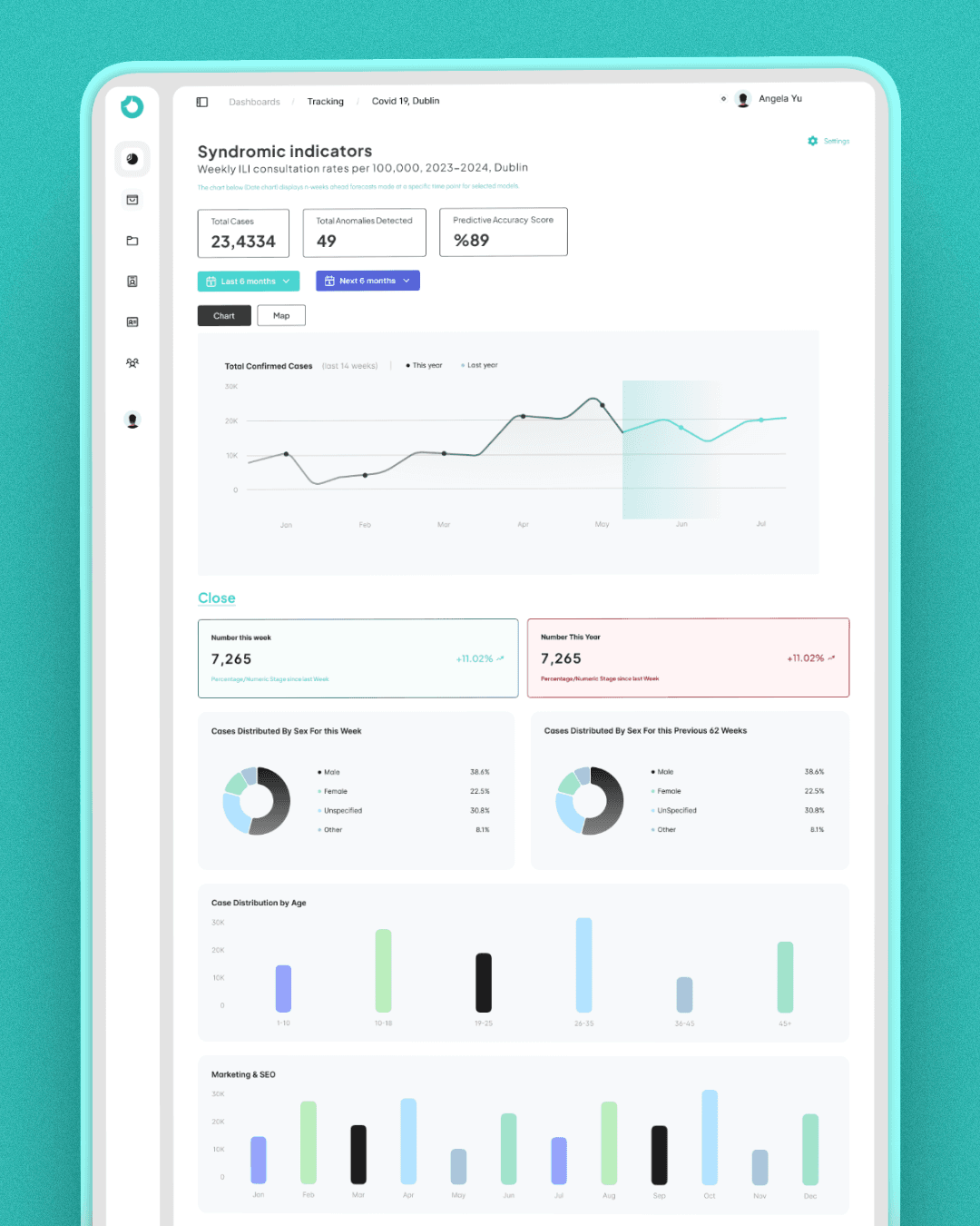
Layouts: The dashboard was designed with a card-based layout to display key data points (alerts, medical records) without overwhelming the user.


Prototyping and Testing
A clickable prototype was created to test the design with users. Feedback indicated that users appreciated the clear layout but suggested refining the alert system to differentiate between low and high urgency notifications.
I refined the design to include a color-coded alert hierarchy, and final testing confirmed that users found the changes helpful in quickly prioritizing health threats.
Final Design
The final design offers a clean, intuitive dashboard with real-time disease alerts, a centralized repository for medical records, and personalized health tips. Key screens include:
Home Screen: Displays outbreak updates, including location and severity, alongside health advice.
Alerts & Notifications: Push notifications for immediate action on urgent outbreaks.
Medical Records: An integrated, easy-to-navigate database for healthcare professionals and patients.
Challenges and Solutions
One major challenge was designing for the integration of real-time data without compromising user experience. We solved this by implementing a notification system that categorizes alerts by urgency, allowing users to focus on what’s most important first.
Another challenge was ensuring that the medical data complied with privacy regulations. By collaborating with data privacy experts, we implemented secure logins and encryption for sensitive records.
Outcomes
Feedback from stakeholders and testers indicated high satisfaction with the user interface and ease of navigation. Early metrics showed that users responded to alerts faster and found the integrated data system useful for making informed decisions. This design has the potential to significantly improve how users and healthcare providers react to emerging health threats.
Reflection
This project highlighted the importance of user-centric design, especially in fields like healthcare where clear, actionable data is critical. In future iterations, I aim to integrate more data sources and refine the user experience based on continuous user feedback.
Free 20-min intro call
Tell us what you’re building
Work with a team that brings clarity, care, and creativity to every project.